Free Stock Trading Course
Lesson Seven
Bearish candlestick pattern
Six bearish candle chart shape analysis
These bearish candle chart patterns formed at the end of the uptrend, indicating a reversal to lower levels. The effect is most pronounced when they are confirmed by the resistance region, such as the main resistance level at the higher time frame, the top of the channel morphology, or the protrusion from the top of the fluctuating bollinger belt and then retreat.
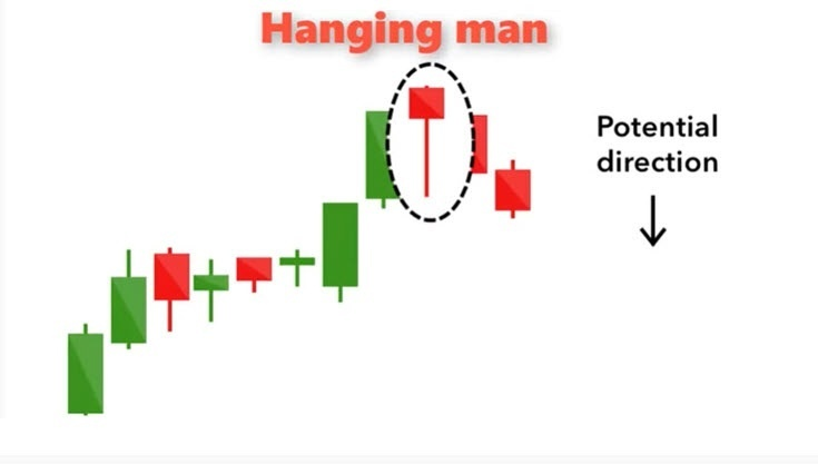
1. Hanging line
The hanging line is a bearish pattern, equivalent to the bullish pattern of the hammer line. Look at the picture below, and you will see why you call it this name. It said there was a big sell-off on the day, but that buyers were able to push prices up again.
However, the massive sell-off suggests that the upward momentum is weakening and we are in a period of indecision. The bearish candle that follows will confirm our belief that a reversal or short-term pullback is coming.
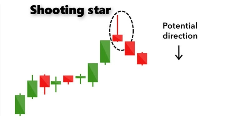
2. Meteor
The shooting star candle pattern is opposite to the inverted hammer line, formed at the end of the upward trend. The lower half of the Shooting Star candle chart is smaller and the upper half is larger. The Shooting Star Candle chart is called a Shooting Star because prices rise during intraday trading, but then fall back to their lows.
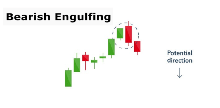
3. The earand pattern
This candle chart pattern appears at the end of the uptrend. You will see a small green (bullish) candle chart entity, and then engulfed by a long red (bearish) candle chart. This suggests a peak or slowdown in the price rise trajectory, signaling an imminent reversal or correction. The stronger the second red candle chart, the more likely there is for a further fall.
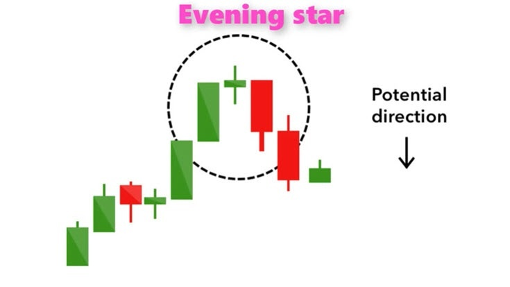
4. Twilight star form
Unlike most other forms discussed in this paper, the Twilight star is a three-star candle form, contrary to the bullish morning star form. You know that you are looking at the evening star when you observe a small green candle sandwiched between a long green candle and a long red candle.
This is a confirmation of a bearish price reversal or correction, especially when the third (or red) candle closes below the opening price of the first candle.
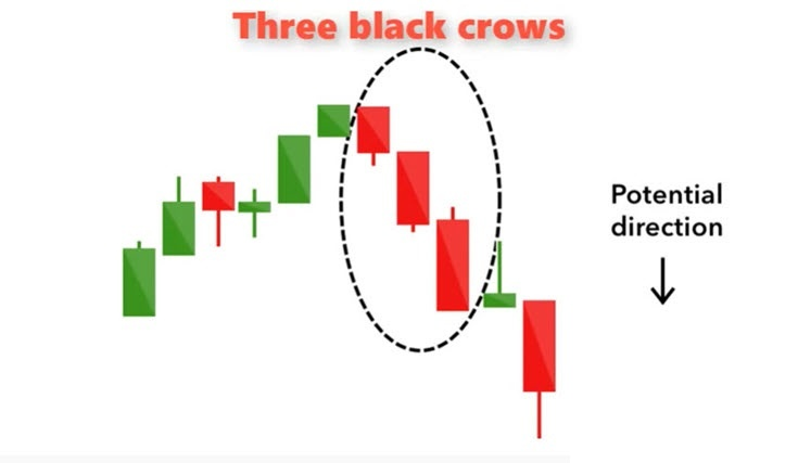
5. Three black crows
The candle chart form consists of three consecutive bearish red candles with very small or no shadows. The closing price of the previous day was almost the same as the opening price of the next day, but the price kept falling every day. Traders interpreted this as the start of a new downtrend.

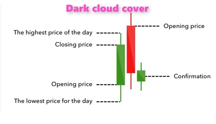
6. Clouds cover the top
This mode tells you that the bearish reversal is underway. The bullish green candle optimism of the previous day was masked by the red bearish candle, which has almost swallowed it, but has not completely swallowed it. It closes below the midpoint. If the second candle has a short wick, then you know that the bearish response to rising prices is decisive.
Four kinds of candle diagram continuation form
While the patterns we've seen so far are reversal patterns, the following patterns suggest that the market has a short break before prices continue to move in their original direction.
1. Cross star
If the price trend on one day (or another period) fluctuates in a very narrow range and almost closes near the opening price, so the candle chart looks like a small cross, you see a cross. The body of these candle drawings is usually short or even absent, but the wick size may vary. This suggests a dispute between buyers and sellers, leading to hesitant price movements.
- (1) The cross is a special K line form, which indicates that the opening price is the same as the closing price during this period, and is represented as a straight line. The appearance of this form shows that the two sides of the fierce competition, each other.
- (2) The length of the upper and lower line also has a very important guiding significance for the shape. Usually, the longer the line, the greater the competition between the long and short; once the market is confirmed, the longer the trend of the stock price will develop.
- (3) The cross usually has two functions: confirm the market and confirm the reversal, the two cases are called "consolidation cross" and "reverse cross" respectively. The reversal cross is larger than the consolidation cross (that is, the upper and lower lines are longer) and appears more at the top or top. The consolidation cross is smaller in shape, the upper and lower shadow line is shorter, mostly in the middle of the trend.
You will see the crosses in the morning and Twilight Star candle patterns, but when they appear alone, they are a neutral signal, more likely to show a pause before the price move continues. Cross can usually behave as "insider day" and therefore can be perfectly applicable to insider day trading strategies.
If you see several cross candles at the extremes and then a price breakout, you should see it as a breakout in price consolidation and can be very strong if reached at or near the trend line.
2. spinning top
The body of the gyro candle pattern is shorter and appears between candles of equal length. This tells us that the market is hesitant. Bulls and bears have equal power.
If you see several cross candles in a area and your analysis shows that the area involves a decision point, such as close to the trend line and then a price breakout, you should see it as a very strong signal that prices will continue to move along the trend line.
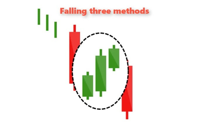
3. Three ways to fall
This involves three consecutive green bullish candles that move in the opposite direction to the current downtrend before prices continue to fall. On the sides of these three candles, you want to see two strong bearish candles, the main body is very long, the shadow line is not obvious.
You would also like to see three green candles included in the range of two bearish candles. That means the bulls don't have enough support to achieve a price reversal, so the price trajectory is expected to fall from here.
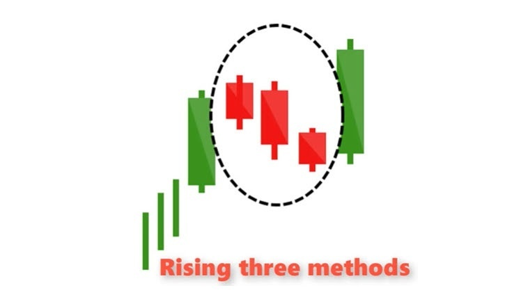
4. Three ways to rise
This pattern is the opposite to the one above. Again, you are looking for three red candles, contained within the range of two decisive green candles. They say the market stops briefly before prices continue to rise.
Now that you have a good grasp of the candle chart form and its meaning, it's a good time to practice identifying the candle chart form, and you can review some stock or forex price charts and highlight them. Watch in what circumstances they are most effective. You can then make a successful trading plan.
Please remember this
Candle chart shape should not be used as an independent signal of trading opportunities. They need to be used in conjunction with other forms of technical analysis, e. g., trend lines, support and resistance regions, MACD, KDJ, etc. When used in this way, they will be strong signals with a high probability of success. This is called "confluence transactions," which is what the most successful and wealthiest traders always do.
Remember that a successful trade doesn't mean winning every time. Successful trading means increasing as many odds as possible. After that, it was just a numbers game.
This concludes the Bearish candlestick pattern lesson. Please use the menu below to navigate to the lesson of your choice.
